Role: Created style guides, designed logo lockups and collateral BEFORE: AFTER: BEFORE: AFTER:
2 Brand Extension Examples
As part of the overall cleanup of the Macy’s brand, my team took on many redesigns of internal and customer-facing programs. Below are 2 examples of how I transformed free-for-all designs into brand consistency (I may or may not have been nicknamed “the logo police” by my colleagues).
The logo lockup broke 2 major brand rules: using “Macy’s” without the star and using type inside the star. Plus the thin type was nearly illegible in digital formats.![]()
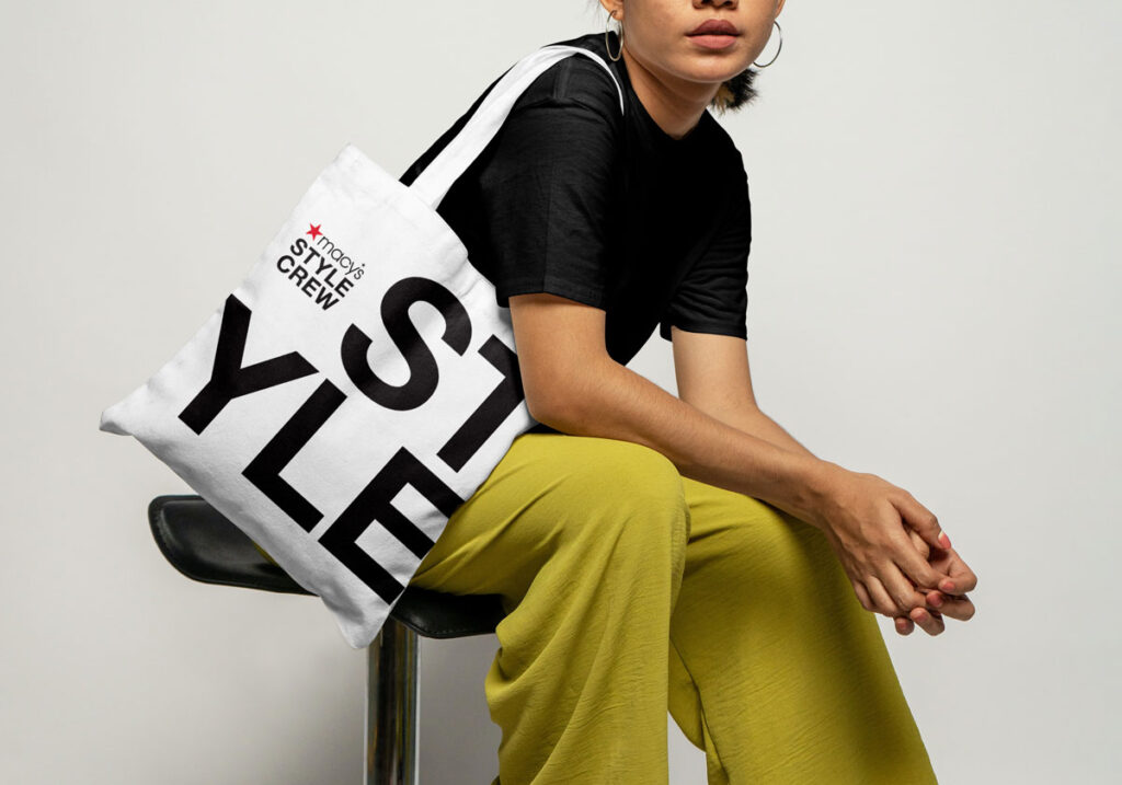
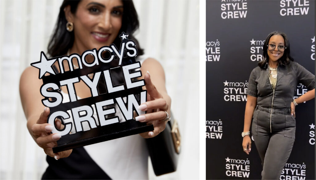
The updated lockup is consistent with the Macy’s style guide, and the type is bold, graphic, and easily readable whether it’s a tiny YouTube watermark or a giant step & repeat.
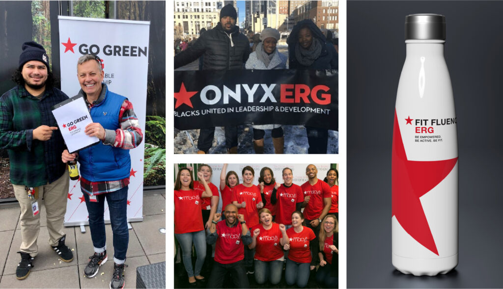
Without a corporate system in place, the Macy’s Employee Resource
Groups had gone rogue. Each one had created their own logos, made their
own t-shirts (green?!) and nothing looked like Macy’s.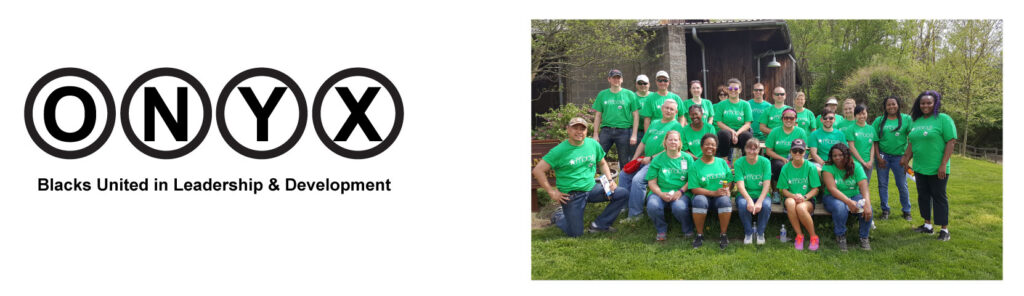
A system, yay! At first the ERG leaders were reluctant to lose their uniqueness,
but we convinced them that aligning with the Macy’s brand helped legitimize their organization
and gave them access to all of the brand recognition and love associated with Macy’s.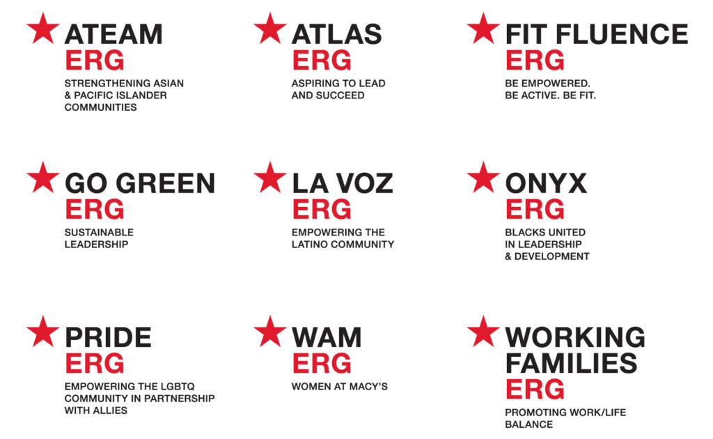
MACY’S
Macy’s Style Crew
Macy’s Employee Resource Groups