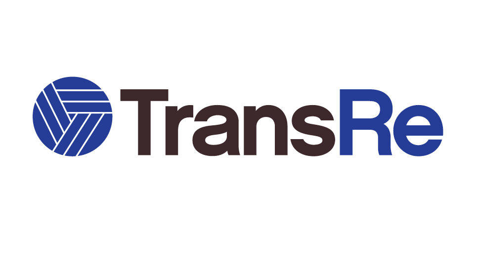
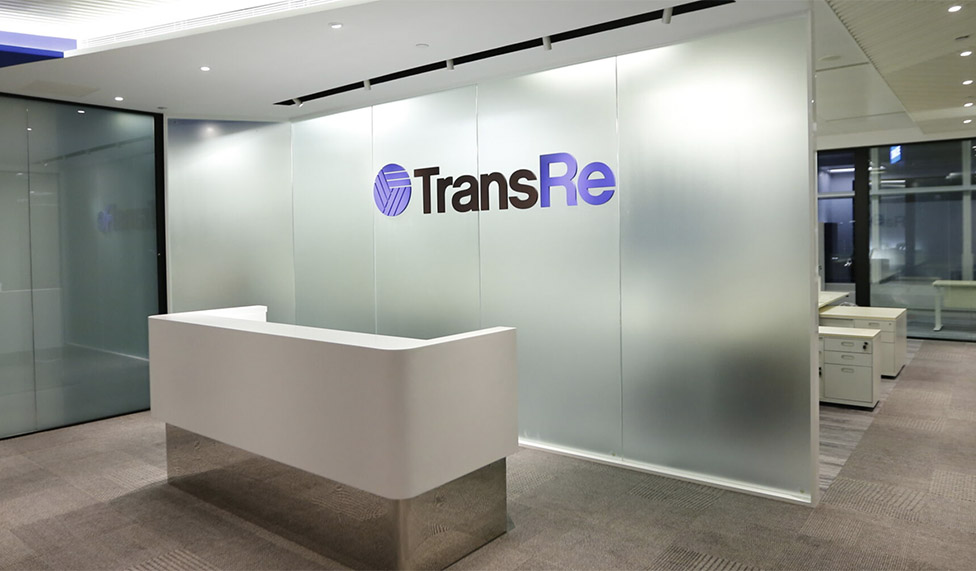
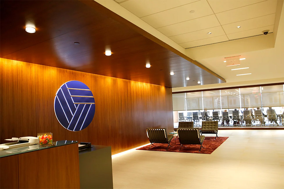
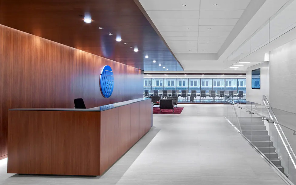
Corporate Brand Identity
TransRe is a global reinsurance company based in NY that needed a complete brand overhaul. I was the lead designer on their account, and while looking for inspiration I found out their CEO was an avid sailor. I researched different nautical imagery and as soon as I saw a photo of a monkey’s fist/sailor’s knot I knew I was onto something. A monkey’s fist is tied onto the end of a rope as a weight, making it easier to throw the line. It symbolizes strength, solidity, and a literal life line – all perfect metaphors for a re-insurance company that helps keep insurance companies afloat. The final mark is of course abstracted (with the bonus of a letter “T” hidden in it), but knowing the story behind it made a compelling presentation. The CEO loved it. I’ve never had a brand presentation go so smoothly.
Role: Logo, website, print collateral design
![]()

![]()
![]()